Artemisia Shopify Website
What We Did
Make everything around us beautiful.
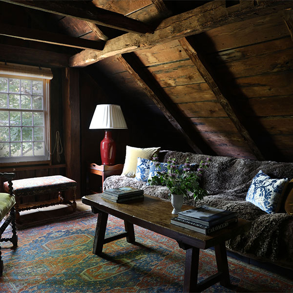
Artemisia is a high-end residential interior design firm and one-of-a-kind shop in Old Lyme, Connecticut. Started by Rosemarie Padovano, Marcello Marvelli, their backgrounds in fine art, and a custom pillow in 2014, Artemisia creates warm, artful, and impeccably styled interiors from the heart of Brooklyn to around the world.
Project Goals
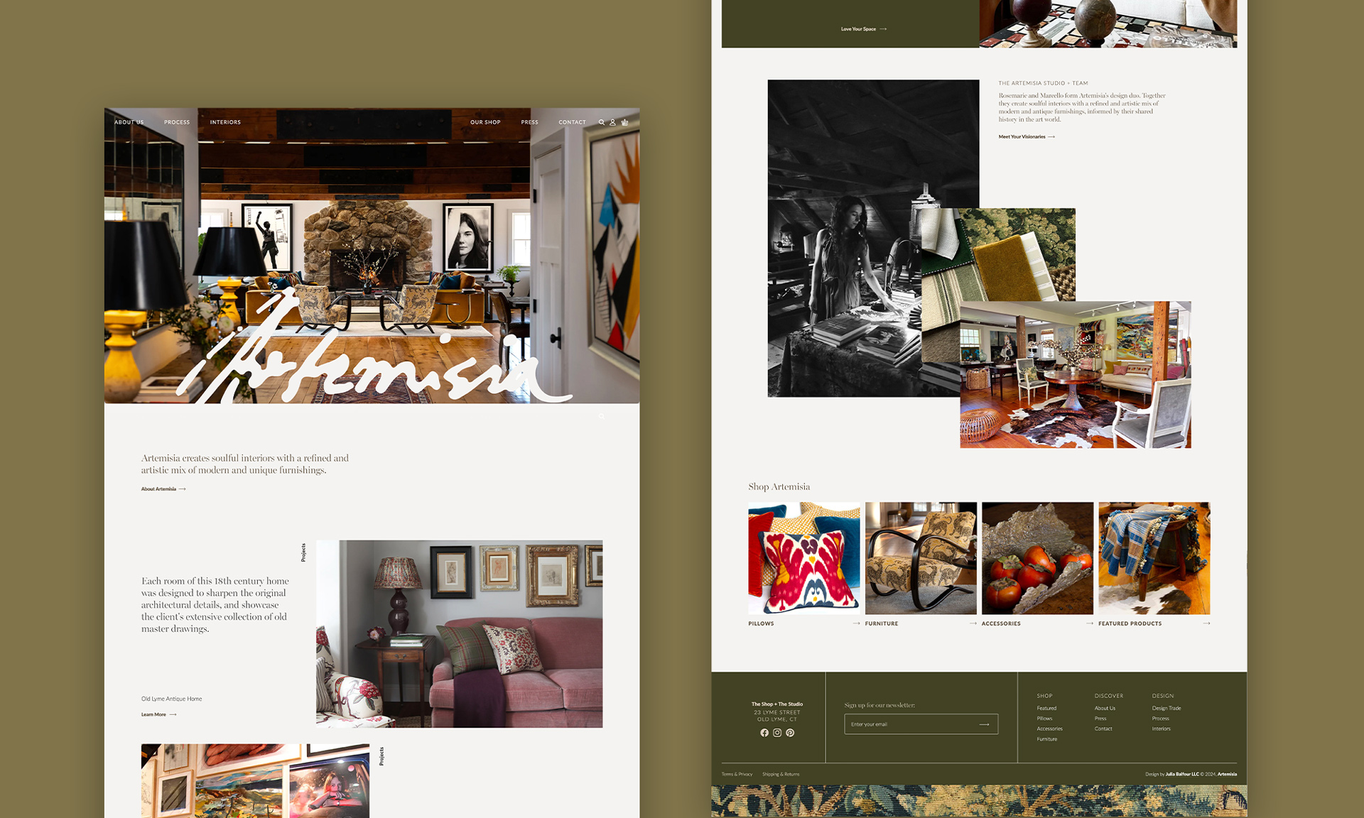
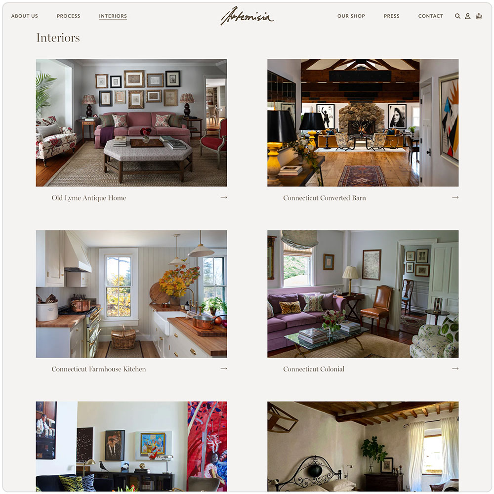
The dream duo at Artemisia enlisted Julia Balfour to completely redo their existing Shopify site from top to bottom. They wanted their new site to come across as warm and approachable but still have that artful feeling — just like one of their spaces. They also wanted to make sure to represent the three legs of thier business: interior design, custom pillow manufacturing, and furniture and vintage antiques. The ultimate goal? A beautiful, easy to use Shopify site that didn’t look like it was a Shopify site.
Quiet luxury meets warm playfulness
Design
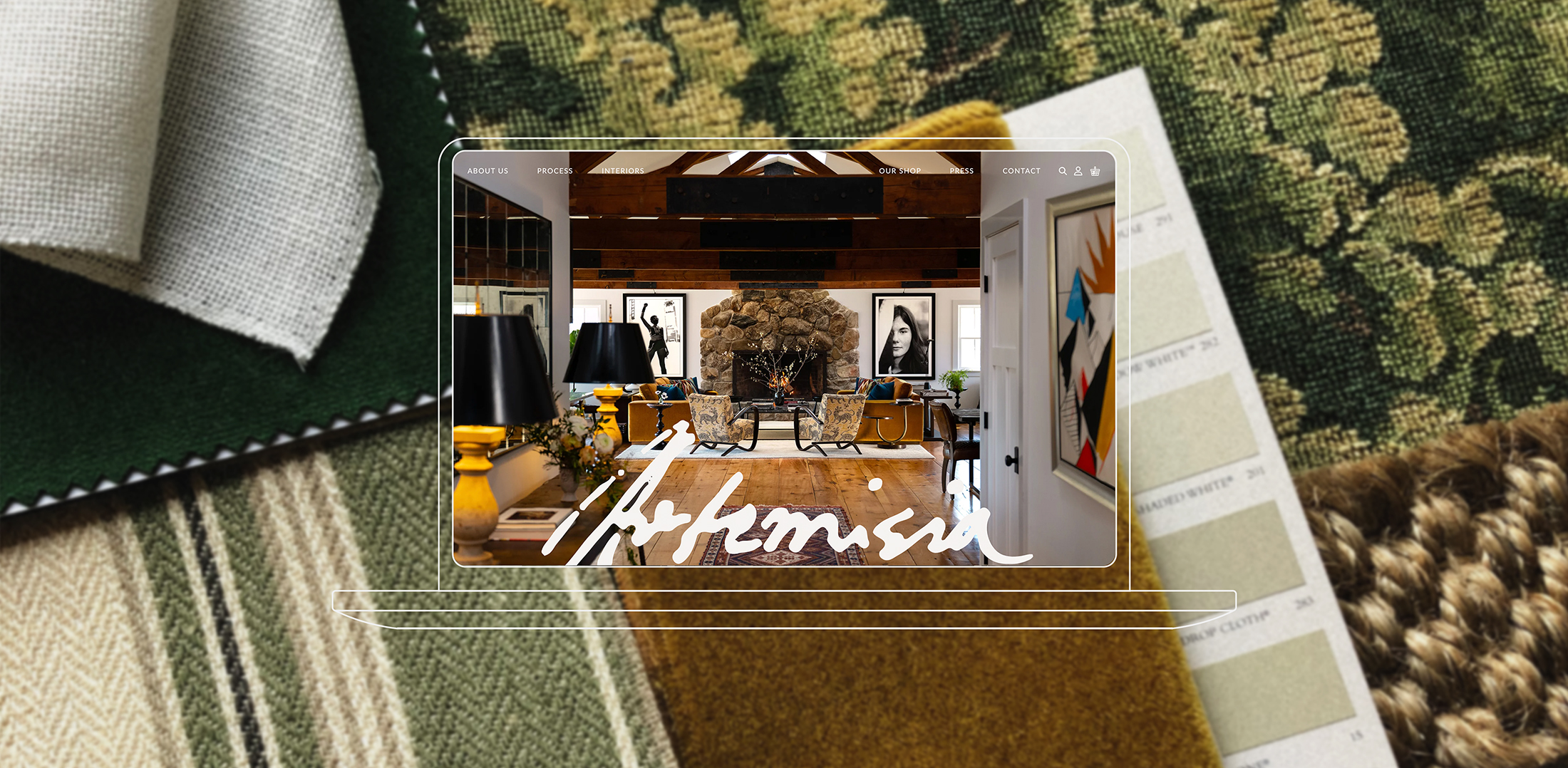
Besides the signature of Artemisia as the logo, Rosemarie wanted to refresh the visuals of the brand. A shade of Farrow & Ball’s Ammonite (one of her favorite colors!) floods the site, acting as a soft, neutral background to the beautiful imagery on it. Shades of green, browns, peaches, and grays create a clean and sophisticated canvas, their tones allowing the rich, earthy hues of their stunning interiors, products, and textiles to stand out, evoking a luxurious yet inviting aesthetic.
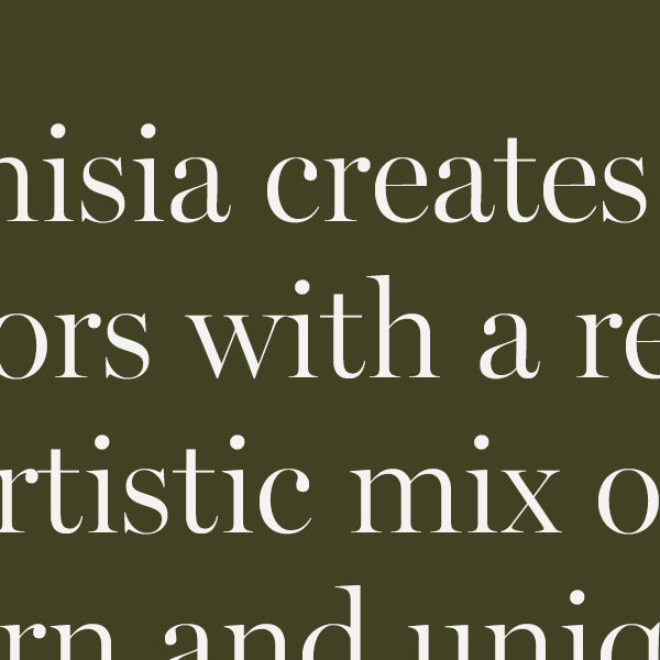
A beautiful serif typeface provides headings, exuding a sense of modern tradition. In contrast, a simple, geometric sans-serif strikes a balance between timelessness and modernity, echoing Artemisia’s focus on blending antique and contemporary design elements.


Shop ‘Til You Drop
Shopify E-commerce
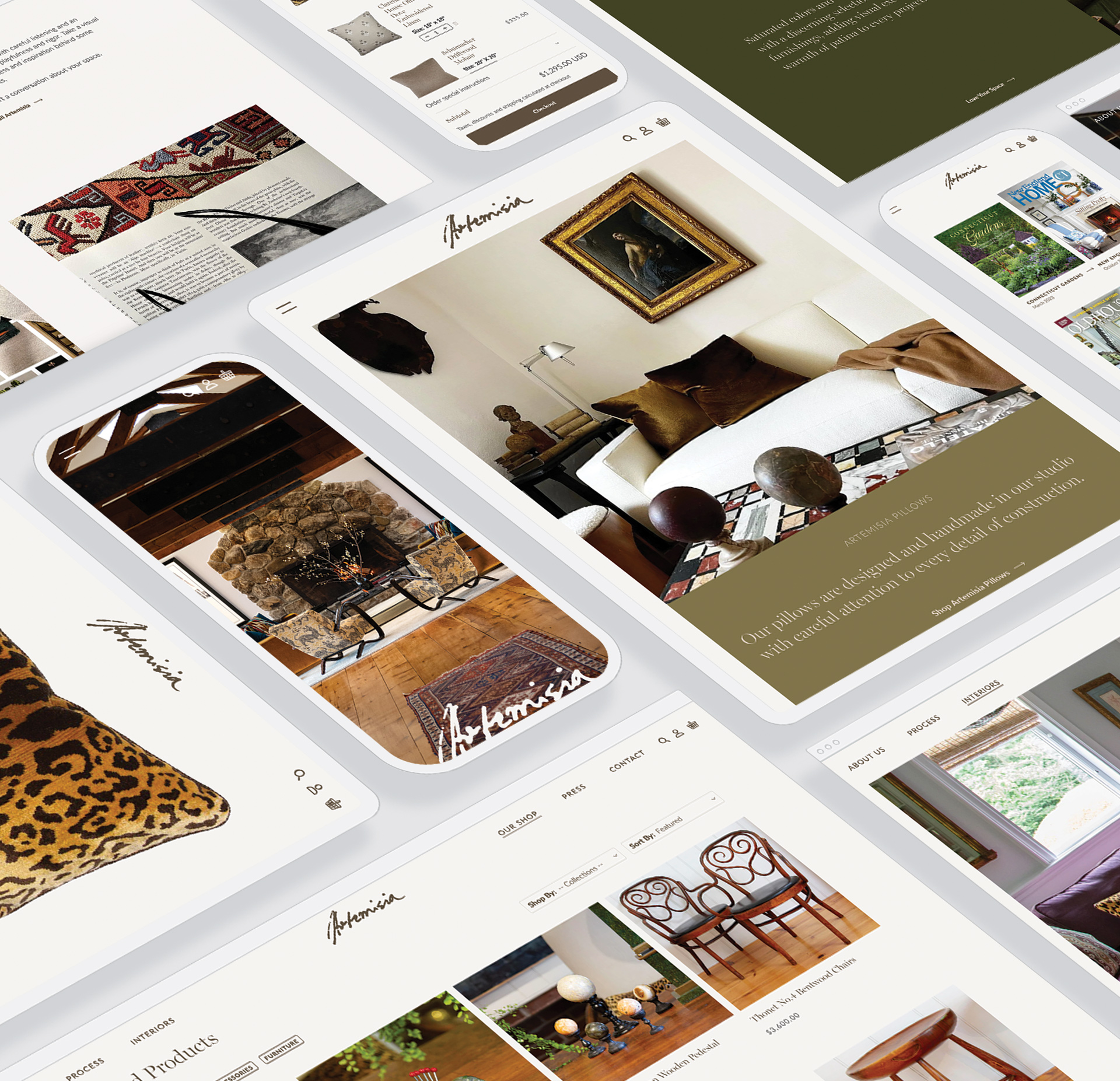
The go-to for any company that sells products, working completely within the Shopify platform was a must for Artemisia. However, both JB and the client didn’t want it to look like a Shopify site. Using the same methodology we do in our WordPress sites, the design and development teams created intricately designed and impeccably coded content blocks that could be used to build stunningly styled pages. Paying special attention to not only case studies, but the shop process from start to checkout was of utmost importance. With clean category pages, imagery focused product pages paired with tidy details, and a quick glace at your basket at anytime, the shopping process is a breeze — for both customer and the Artemisia team themselves. Fill up that basket, and go!
We got such wonderful feedback on the website. Glowing reviews in fact! Most importantly, a few people said it really captures who we are as Artemisia. One of my friends said it was a ‘stunning representation of what we do!’ That was our goal, so thank you!
Rosemarie padovano
c0-Founder + co-owner, Artemisia
