Jefferson Radiology Website
What We Did
The highest quality of care.
Jefferson Radiology is the largest radiology practice group in Connecticut, providing world-class radiological care in a warm, friendly environment.
Project Goals
The Jefferson Radiology team came to us looking for a modern website design and it became clear there was only one problem with their old website. It couldn’t keep up! This savvy, all female team needed a tool that could deliver clear navigation for current patients and flawless campaigns for new patients.
The Results
41.24%
Average Session Duration Improvement
27.85%
Pages Per Session Improvement
15.89%
Organic Search Users Improvement
-35.96%
Bounce Rate Improvement
No More Clinical
Design
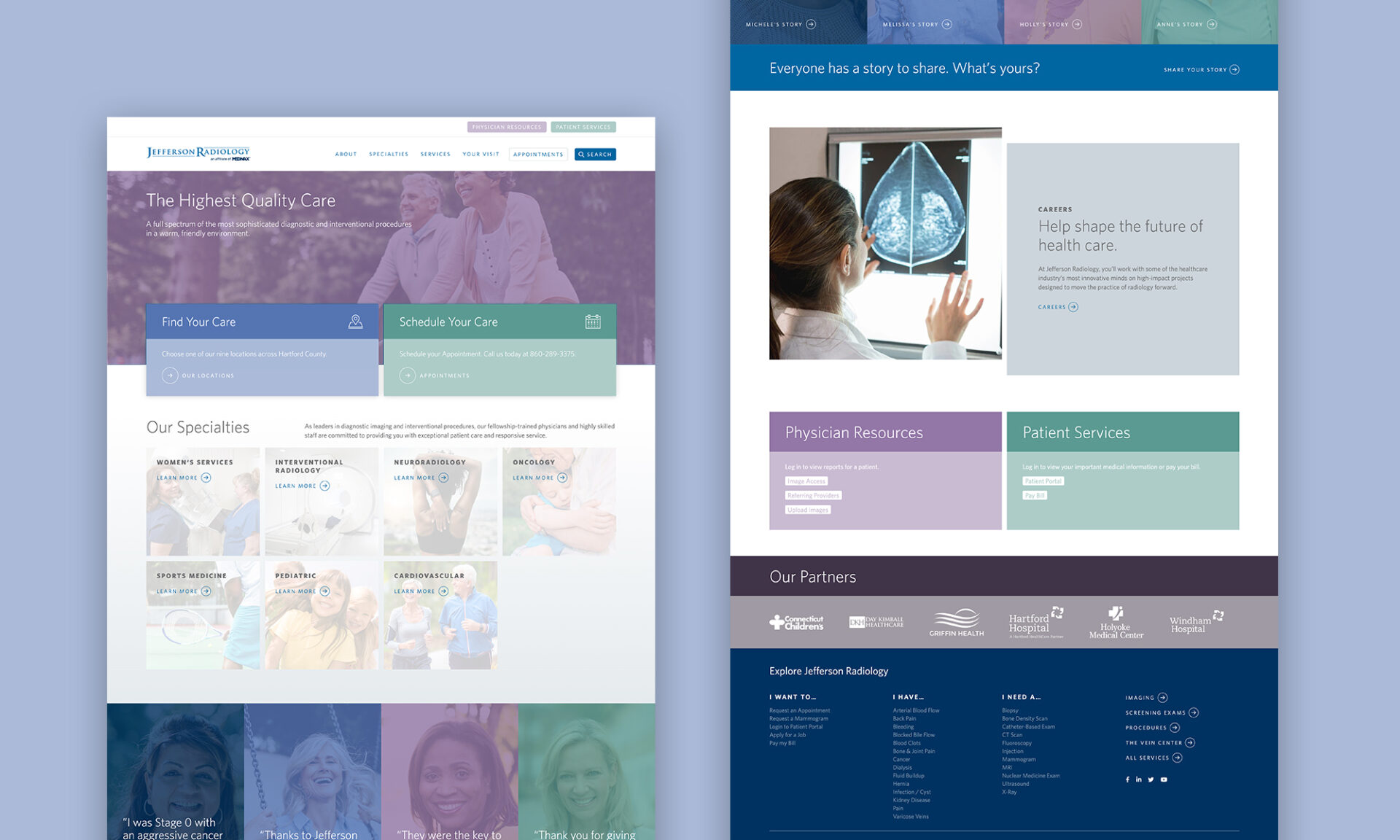
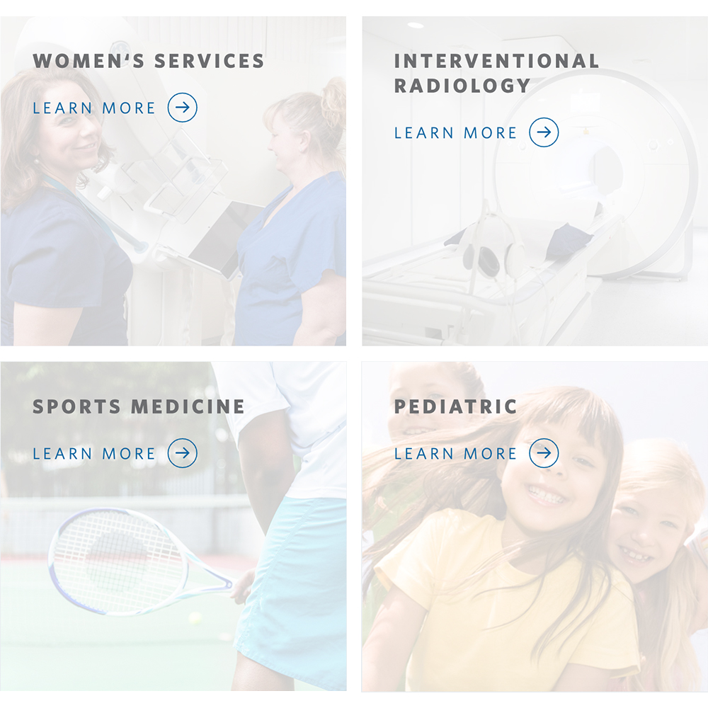
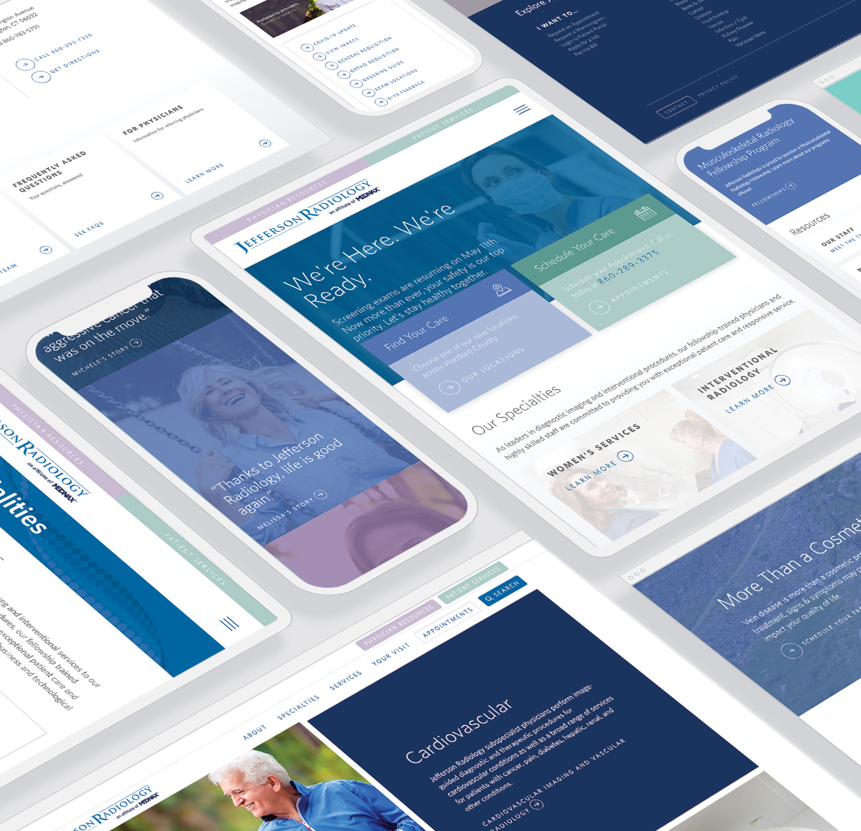
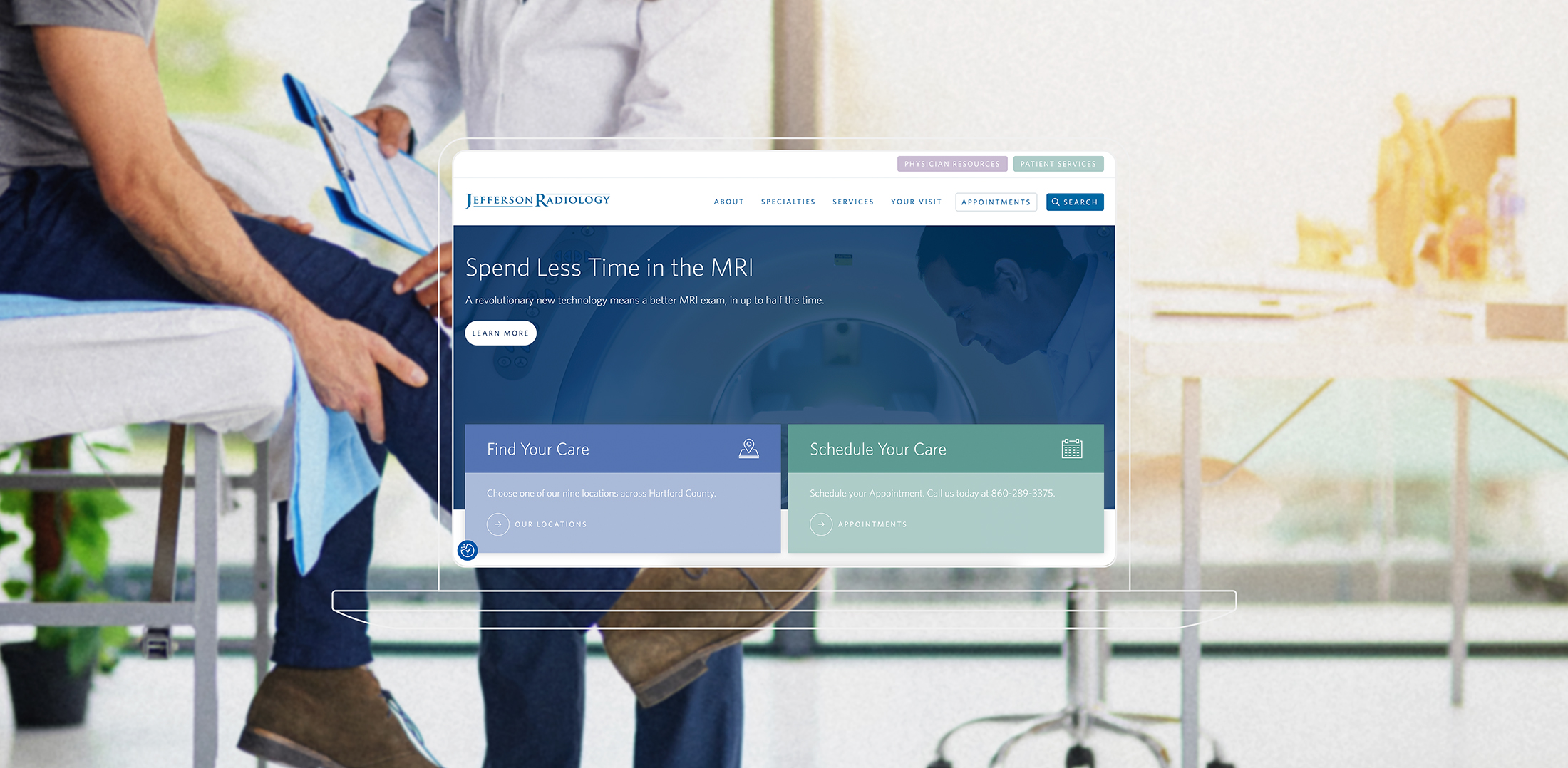
One of the creative team’s major goals in redesigning the Jefferson Radiology website was to create an aesthetic that had a less clinical feel. We used a calming yet professional color palette full of blues, greens, and purples to tell a story and to infuse a more familiar feel on the website for users. Low opacity overlays and an approachable san serif typeface rounded out the design.




Audience Segmentation
Strategy
During our consultation, we were brainstorming how a tool could make page editing more efficient and also create a cleaner user experience and an idea was born.
“What if admins could create a single exam or procedure page and then check off all of the service line areas it is supposed to exist? This way there is no duplicate content for SEO and but also everywhere your users need to find them.”
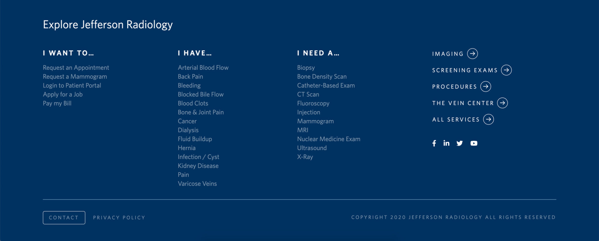
This idea was later confirmed when reviewing the analytics of past user behavior. Users often went to interactive service finders linked to in the footer. The Julia Balfour content strategy team leveraged the data points and logic of these two search tools to create the navigation of the new Jefferson Radiology website. Users can now easily find care by specialty and service type at any point of entry in their experience.
Also, all the care pages have the same design layout with a “Need to Know and Nice to Know” section for users. This helped to parcel out information that was important without overwhelming them with all the details.

